Week 1 (10/01/2023) - Week 2 (20/01/2023)
Joey Lok Wai San (0350857)
Bachelor of Design in Creative Media
Design Principles: Exercises
In Weeks 1 and 2, I learned a lot about the elements and principles of design. Major thanks to Dr. Yip Jinchi for the lecture videos, and to Dr. Charles for the further explanation during our lessons. These are very valuable pieces of information that will benefit my learning and future designs.
Table of Contents
1. Elements & Principles of Design
3. Gestalt Principle - Principle of Closure
ELEMENTS & PRINCIPLES OF DESIGN
Elements of Design
The elements of design are essentially the ‘building blocks' for a design. These include point, line, shape, form, texture, space, and color.
1. Point
The simplest element of design
When used repetitively, it forms a line
When moved in space, it creates 2D and 3D figures and forms
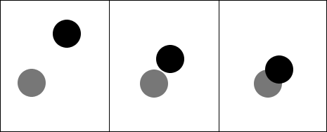
Fig 1.1 Points
2. Line
A line is any two connected points
Active or static, aggressive or passive
Indicate directions, define a shape and space, imply volumes or solid masses, and suggest motion or emotion
Can be grouped to form light and shadows, and patterns and textures

Fig 1.2 Lines
3. Shape
Two-dimensional area
Visible when the line(s) enclose an area, change in value (lightness/darkness), color or texture sets an area apart from its surroundings
Two categories of shapes:
Geometric: regular and precise (circles, squares, triangles, etc.)
Organic: irregular, often curved or rounded (similar to shapes found in nature)

Fig 1.3 Shapes
4. Form
A three-dimensional area
When form encloses space, the space is called volume
With two-dimensional media (e.g. painting), the form must be implied

Fig 1.4 Form
5. Texture
Tactile qualities of surfaces or the visual representation of those qualities.
All surfaces have textures that can be experienced by touching or visual suggestion.
Two categories of texture:
Actual - experienced by touch
Simulated or implied - created to look like the real texture

Fig 1.5 Texture
6. Space
Space is the seemingly empty space around us
The space of a picture is defined by its edges
Three-dimensional space is experienced when we are in it. From the outside, we experience mass. From the inside, we experience volume
In graphic design, space, or depth, refers to the area that a shape or form occupies. Space can be defined as positive (filled space) or negative (empty)

Fig 1.6 Space
7. Color
The visual byproduct of the spectrum of light
Hue: Colours of the spectrum, e.g. yellow and green.
Value: Lightness or darkness from white through greys to black. Black and white pigments are important in changing color values.
Intensity (or saturation): The purity of a hue.
Color groupings that provide distinct color harmonies are called color schemes:
Monochromatic color schemes are based on variations in the value and intensity of a single hue
Analogous color schemes are based on colors adjacent to one another on the color wheel
Complementary color schemes emphasize two hues directly opposite each other on the color wheel.
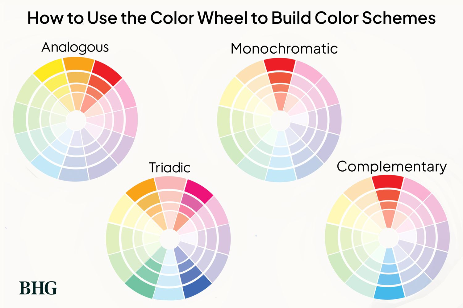
Fig 1.7 Color Wheel
Principles of Design
The principles of design are the way artists use the elements in a design. These are contrast, balance, emphasis, movement, repetition, harmony, unity, symbol, word and image, gestalt theory, etc.

Fig 1.8 Principles of Design
The design principles I chose for this exercise are: Contrast and Gestalt Theory - Principle of Closure. Click to go to each design principle.
CONTRAST
1. Visual Research
For this exercise, I chose to concentrate on contrast because it was the first principle that grabbed my attention. I wanted to create a visual impact in my illustration, and contrast is a good principle to do so.
Contrast is the juxtaposition of strongly different elements. There needs to be a striking difference between two opposite elements in an art piece (Study.com, 2022). The visual experience would be monotonous without contrast. It is used to provide visual interest, capture attention, emphasize a point, and create drama.
Examples: light vs. dark colors, rough vs smooth textures, complementary colors, etc.

(Not to be confused with emphasis which is used to create dominance and focus in
design work. While these are two different principles, they also share lots of similarities. It is easy to mix them up which I did MULTIPLE times (slapping my head).)
2. MY DESIGN PROCESS
2.1 Visual References
These designs have inspired my own contrast piece. I was particularly fascinated by the graphic design poster series, 'Cut A Tree. Kill A Life.', by the Malaysian Nature Society. It has a strong use of juxtaposing colors and conveys powerful visuals and messages. The red and black foreground contrasts nicely against the bright beige background.

Fig 2.2 Visual Reference

Fig 2.3 Visual Reference
2.2 Idea Exploration
I decided to go with the theme of animal cruelty in the fashion industry. My idea was to illustrate someone draped in animal fur and its blood to signify animal cruelty.
After researching, I discovered that rabbits are commonly used for fur clothing. I thought it especially fitting considering 2023 is the ‘Year of the Rabbit’.
I drew inspiration from Cruella De Vil's outfit, with her obsession to use the skins of animals to turn them into fashion items, more specifically a fur coat. I was also inspired by the animal cruelty posters and chose to follow the same red, black, and white color palette, which was coincidentally the same colors as Cruella De Vil.

Fig 2.4 My Inspiration

Fig 2.5 My Inspiration
Sketches
I started off with a simple sketch of a figure in a white fur coat covered in red. I liked the composition of this sketch, it captured the idea I wanted to go with. However, I felt that the face would draw too much attention from the main focus of 'red blood'.

Fig 2.6 Contrast Draft + Rough Sketch

Fig 2.7 Adding base color

Fig 2.8 Initial attempt presented
This was the first attempt at the final piece. However, as Dr. Charles said in his feedback, it does not demonstrate a strong impact on the theme of animal cruelty.
The hands were placed too close to each other, leaving no space for the rabbit connected to the fur. I also found this attempt to be messy and unfinished.

Fig 2.9 Redesign (after feedback)
I repositioned the arms and removed the lines to make the design look cleaner.
The rabbit blends in with the fur coat to show that it was used to make the product.
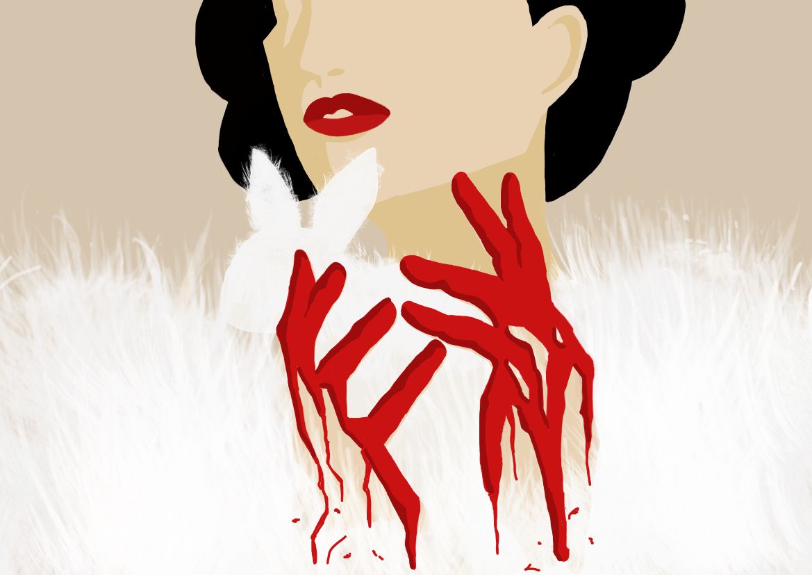
Fig 2.10 Adding shadows, texture, and contrast element
The red symbolizes the animal bloodshed and torture on human hands (literally) just for a piece of clothing. It makes the overall design feel striking and shocking.

I did not place much blood or additional color as it would draw attention away from the hands and red contrast.
2.3 Final Outcome with Rationale

2.4 Lecturer's Feedback
Have a stronger impact on the theme of animal cruelty -have the fur identified
GESTALT THEORY - PRINCIPLE OF CLOSURE
1. Visual Research
I decided to focus on the Principle of Closure from Gestalt Theory. I thought it was one of the most interesting yet challenging principles, especially when having to trick the viewer’s eye and perception.
Gestalt principles are rules that describe how the human eye perceives visual elements. These principles aim to show how complex scenes can be reduced to more simple shapes. The black-and-white color scheme is commonly used in most designs, alongside complementary colors.
The principle of closure states that the human eye prefers to see complete shapes (UserTesting, 2022). If the visual elements are not complete, we will fill in the blanks to perceive a complete object by filling in the missing visual information. For example, a circle drawn using broken lines is still perceived by the brain as a circle.

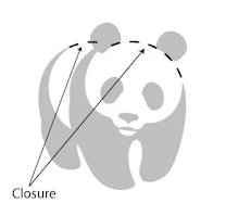
The mind fills the empty gap between shapes
2. MY DESIGN PROCESS
2.1 Visual References
These artworks have influenced my Principle of Closure design. I was particularly interested in the use of hands and the human form. It has a flexible shape that can be easily manipulated to form any object easily. I especially liked the way the arms are wrapped around each other, it gives a comforting and secure feeling.

Fig 3.3 Visual Reference

Fig 3.4 Visual Reference
2.1 Idea Exploration
I decided to go with the theme of parentless childhood. While I cannot relate to this story, I still find it disheartening. My concept was to illustrate someone who has lost a parent from a young age, and how they can only exist in the child’s heart and imagination. The parent is non-existent and thus would fade into the background, without any completed outline. Meanwhile, the child is fully present and alive, therefore we see the full outline.
I was also inspired by the posters above and chose to follow a black-and-white color palette with a figure wrapping their arms around the other. Black is often associated with death (the parent) and white is the opposite (the child).
Sketches
I started off with a rough sketch of two people hugging. I decided on a height difference to suggest the parent-child relationship.

Fig 3.4 Positioning the figures
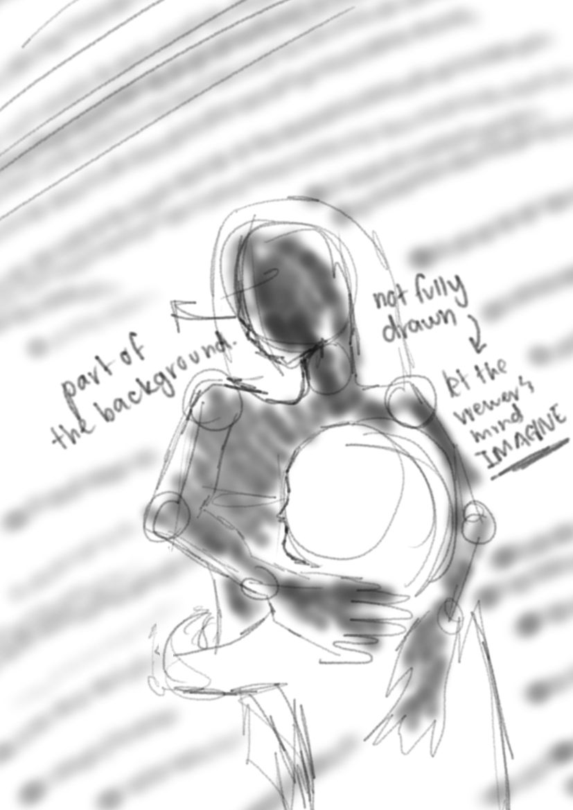
Fig 3.5 Closure Draft + Rough Sketch
I like the overall idea of this sketch because it captured the idea of loneliness, and togetherness at the same time.
The outline of the mother is incomplete, which leaves it up to the viewer’s imagination. They are not there fully and only exist in imagination (to the viewer and to the child). Meanwhile, the child is a fully drawn shape; they are present, solid, and very much alive.
Fig 3.6 Messy outline + Blocking out colors
After I got an idea of what I wanted, I went on to block out the colors. However, I did not like how flat the hair felt in the initial draft. To combat this, I added a curl to have some movement and shape the body so it does not go missing with the same colored background.
The drafting stage is always the messiest, but after this, I really liked the positioning and how it looked.

Fig 3.7 Drawing it out properly
The piece came together once I drew everything out properly. I liked how everything looked except for the mother’s hair and the child’s head. Something looked off, which led me to redesign them a little.

Fig 3.8 Redesign + details
I removed the hair connecting to the child and lowered the hairline. This left the mother’s body to go with the background and create empty space. Therefore, leaving it up to the imagination to picture the full body.
For the child, I extended the head a little to further shape the mother’s hand. I also extended the child’s arm to make it look more natural and like they are trying to hug back.

Fig 3.9 Adding texture
I added some texture to the mother’s figure. This is to show how, unlike the child, she does not truly exist. The color and texture make it feel like she is becoming part of the background, compared to the child who stands out completely from the background. Not only did this give the design a bit more meaning, but it also adds variety and takes away how plain it looked.
2.3 Final Outcome with Rationale
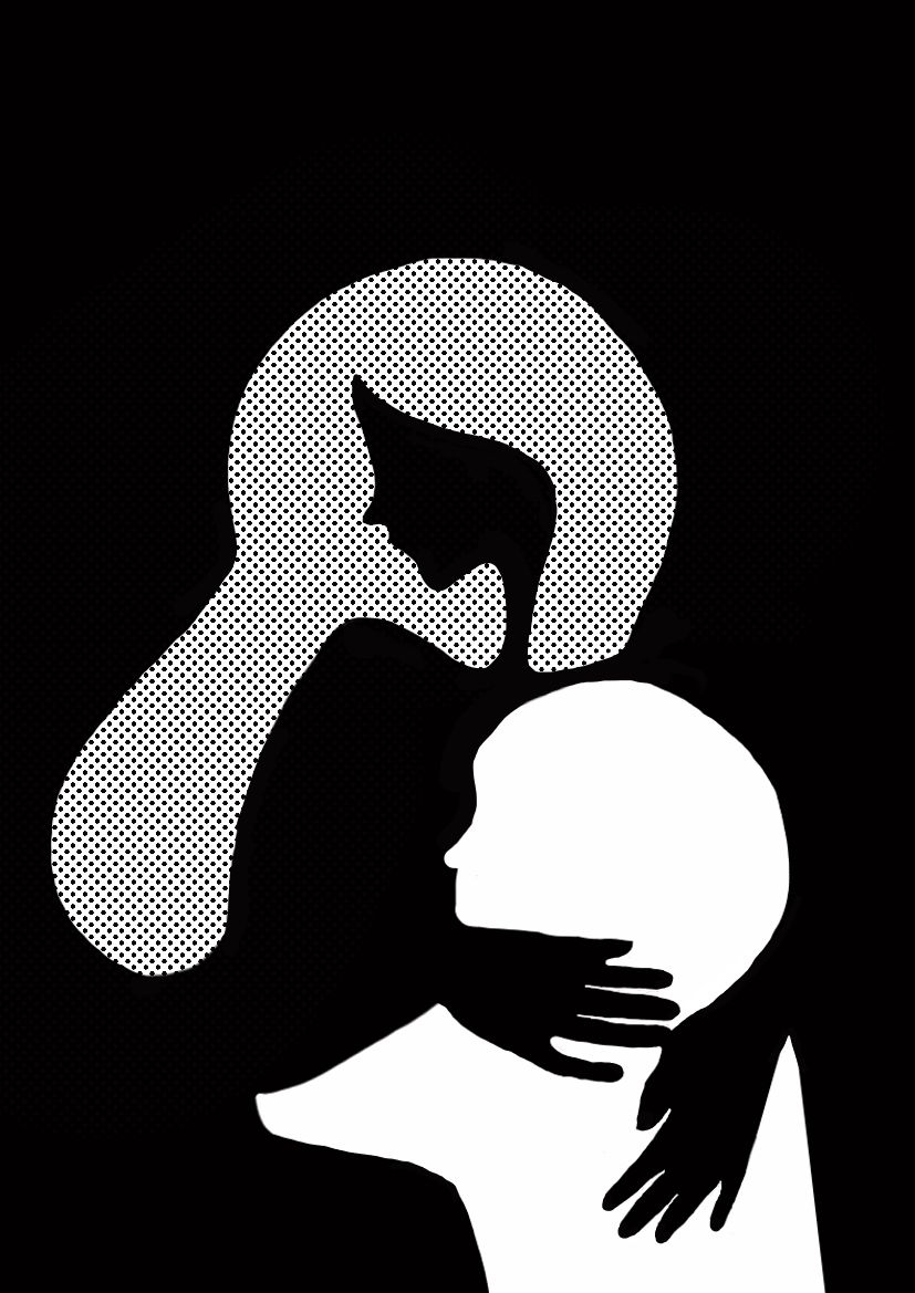
Fig 3.10 Final Gestalt Theory Outcome - JPEG A4 Size (21.0 x 29.7cm)
Rationale: A principle of closure design about a child who lost a parent at a young age. The parent is non-existent; their figure is not completely outlined and left to the imagination. The child exists fully, with a strong outline, and can only imagine the presence of the parent.
2.4 Lecturer's Feedback
Possibility to expand these ideas
REFLECTION
This exercise assignment was very enjoyable and educational. I learned a lot about the elements and principles of design, specifically their functions, and how to utilize them effectively in my own works. The elements are building blocks for a design and the way each principle of design is used can enhance a piece considerably. I really enjoyed the amount of freedom we were given, we got to choose our own theme as opposed to having one decided for us. It is not very common we get to pick what we want to draw, so I appreciate it greatly. It has been over two years since I picked up a brush, let alone create an art piece. This experience was a great way to practice and brush up on my skills (and see that I still had some THANKFULLY).
The two design principles I chose were interesting in their own way; the contrast in designs creates drama and a striking visual interest, while the gestalt principles are outstandingly fascinating in its way of tricking the eye and mind. Personally, I was immediately drawn to the gestalt principles because it is not very common to see them. I found it a little challenging to understand, much less to create a piece. However, thanks to Dr. Charles's explanation during our sharing session, it was much easier to comprehend and I was really excited to create a design for it. I really liked the concept of having a non-present figure comforting a child and making them seem far apart yet close together. I also liked the idea of my contrast piece and I am most happy with the redraw of it, it looks much cleaner and relatable to the theme. While this may not be my best work, I am quite happy with what I managed to accomplish in a short time. If given more time, I would have done better with the finishing and added more details. All in all, I am really satisfied with my work given that I am quite rusty with my skills. The exercise was a fantastic experience and I gained a lot of knowledge that I have no doubt will come in handy in the future.
REFERENCES
Study.com. (2022). Contrast as a Principle of Design. Retrieved from https://study.com/academy/lesson/contrast-as-a-principle-of-design.html
UserTesting. (2022). 7 Gestalt principles of visual perception. Retrieved from https://www.usertesting.com/resources/topics/gestalt-principles#:~:text=The%20principle%20of%20closure%20states,can%20still%20recognize%20the%20pattern.
Fig 1.1: https://vanseodesign.com/web-design/points-dots-lines/
Fig 1.2: https://xd.adobe.com/ideas/process/ui-design/6-elements-design/
Fig 1.3: https://www.dafideff.com/2018/05/visual-element-of-graphic-design-shape.html
Fig 1.4: https://www.dafideff.com/2018/05/visual-element-of-graphic-design-form-and-typography.html
Fig 1.5: https://slideplayer.com/slide/4540953/
Fig 1.6: https://www.delesign.com/blog/7-elements-of-design
Fig 1.7: https://www.bhg.com/decorating/color/basics/color-wheel-color-chart/
Fig 1.8: https://www.wix.com/blog/2018/07/7-principles-of-design-websites/
Fig 2.1: https://www.google.com/url?sa=i&url=https%3A%2F%2Fwww.widewalls.ch%2Fmagazine%2Fcontrast-in-art-and-the-value-of-the-opposites&psig=AOvVaw08IglKUcm15_s8dmPGAX9K&ust=1674280913531000&source=images&cd=vfe&ved=0CBEQjhxqFwoTCKCa-8q81fwCFQAAAAAdAAAAABAE
Fig 2.2: https://clios.com/awards/winner/design/malaysian-nature-society/cut-a-tree-kill-a-life-tapir-811
Fig 2.3: https://www.behance.net/gallery/28144801/Cut-A-Tree-Kill-A-Life
Fig 2.4: https://disney.fandom.com/wiki/Cruella_De_Vil
Fig 3.1: https://www.interaction-design.org/literature/topics/gestalt-principles
Fig 3.4: http://clipart-library.com/clipart/pi5rnEX5T.htm
Comments
Post a Comment