.png)
Week 3 (23/01/2023) - Week 4 (03/02/2023)
Joey Lok Wai San (0350857)
Bachelor of Design in Creative Media
Design Principles: Project 1 - Self-Portrait
Table of Contents
2. Self-Portrait Design Process
PROJECT BRIEF
For this project, we were asked to create a portrait of ourselves while also applying the various principles that we had learned from the Design Principles: Exercises. We were free to start this project however we wanted, including observing our surroundings, contemplating our life experiences (family, friends, school days), and what brings us joy. I began by watching the lecture video and researching further about it; below is what I have learned about the art of self-portrait.
The Art of Self-Portrait
A self-portrait is a self-representation of the artist in the form of a design, mainly through the medium of painting, drawing, sculpture, or photography. It is a visual depiction of the self - in other words, how one sees themselves (physical image), what they are feeling (mental image), and how one wants to be seen by others (Study.com). It is not necessarily about creating a realistic image, instead, it is about self-exploration. Artists in general use and explore their characteristics to determine their personal and social identity.
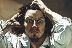
Fig 1.1 Self-Portrait Example: ‘Le Désespéré’ by Gustave Courbet

Fig 1.2 Self-Portrait Example: ‘The’ by Frida Kahlo
To start with this assignment, I did a mind map about myself to understand myself better. I also did an online personality test, but that didn’t really help much.
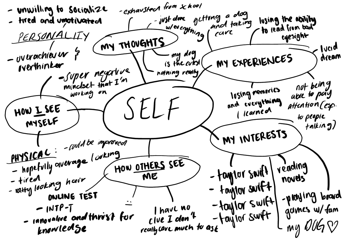
Fig 1.3 Mindmap exploration of myself
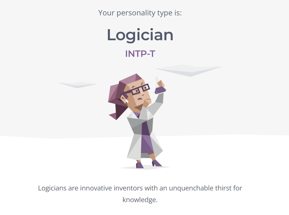
Fig 1.4 Myers-Briggs (16 Personalities) test
SELF-PORTRAIT DESIGN PROCESS
1. Visual References
I have been practicing a more graphic style recently and decided to challenge myself to use that style in a self-portrait, relying more on line, color, and tone. I was particularly interested in the use of multiple human figures/ faces that can be easily distinguished by contrasting colors.
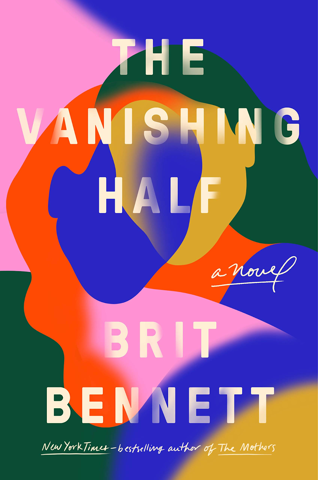
Fig 2.1 Visual Reference: ‘The Vanishing Half’ Book Cover
When I thought of graphic style, bright contrasting colors, and multiple figures, the cover of ‘The Vanishing Half’ instantly came to mind. While I have not read this book yet, the cover’s design has always caught my attention and intrigued me. What may look like blobs of color, actually shapes into two human figures.
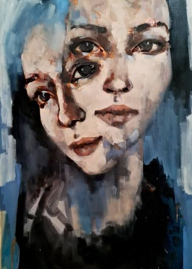
Fig 2.2 Visual Reference by Thomas Donaldson
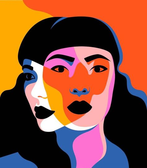
Fig 2.3 Visual Reference by Petra Eriksson
2. Idea Exploration
I wanted to create a drawing of my full face, but also combine it with the knowledge I learned about self-portraits, that it is not just about creating a realistic image, but rather a form of self-expression.
Instead of going for two faces, as shown in the visual references, I decided to go with three. Being inspired by this Japanese proverb:
“The Japanese say you have three faces. The first face, you show to the world. The second face, you show to your close friends and your family. The third face, you never show anyone. It is the truest reflection of who you are!” - Japanese Proverb
The Japanese Proverb theory, or 3 face theory, states that we, humans, have 3 faces each presented to different categories of people (Kazmi, 2021). The first face is what we want to show to the world. The second face is the one we show to our family and friends, to the people we are close with. Lastly, the third face is the one we hide from everyone, we never show this to anyone and that is the truest reflection of who we actually are.

Fig 2.4 Visual Reference for Color Scheme
Explanation and Idea
First Face (Me): Blue
Blue is one of my favorite colors, and it contrasts and stands out from the other faces because how I view myself is very different from how others view me.
Not only does the color represent spiritually and inner peace, but more importantly it is commonly associated with emotional fragility, sadness, and depression. A blue person can be perceived as cold, unemotional, and unfriendly. All this describes how I see myself on the inside.
Second Face (Close friends/family): Pink
Pink was my favorite color growing up as a child.
Pink is a nurturing, playful, and nostalgic color that takes me back to my childhood. It is often described as a feminine color, linked to love, optimism, and kindness, as well as negative sides that can seem vulnerable and silly. All of which I use to describe myself to people I am close with.
Third Face (Other people): Orange
Growing up, orange has been my least favorite color. However, it’s an attention-grabbing color, especially when combined with cool blue. This color is what I want the audience to be drawn to, like how I show myself to most people.
Darker shades of orange seem to have the most negative associations, such as untrustworthiness and deceitfulness. While lighter shades are associated with optimism and energy. Combining both dark and light shades, it shows how I present myself as an optimistic and energetic person, but really it is all an illusion.
The blue contrasts nicely against the warm pinks and oranges. This also symbolizes the contrast of who the faces are for: blue is for the way I view myself and for my eyes only, and the warm colors are for other people.
Sketches
I started off with a rough sketch of the three color faces. I decided on putting the blue face front and center as it truly represents me, how I see myself, and my personal thoughts.
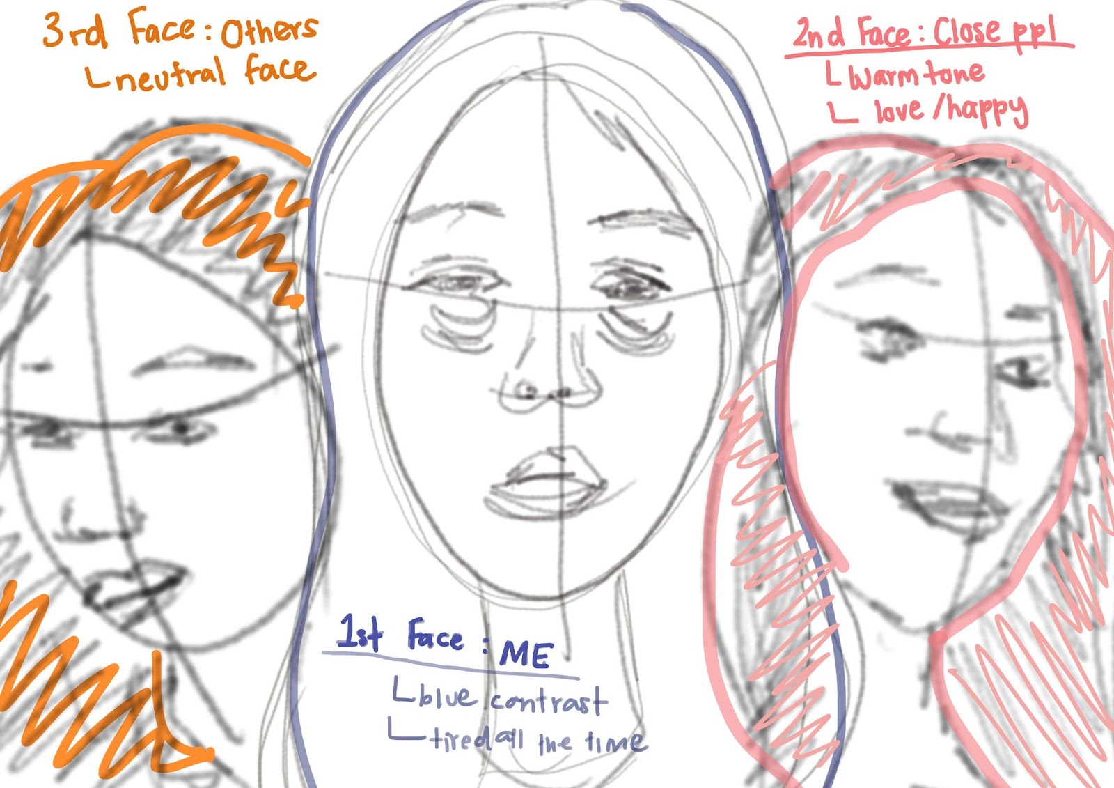
Fig 3.1 Self-Portrait Draft + Rough Sketch

Fig 3.2 Colored Sketch + Initial Attempt
This was the first attempt at blocking out the colors. However, the ‘pink face’ was more orange than the ‘orange face’, which was a redder shade.

I redesigned the ‘pink face’ to seem more joyful and made the ‘orange face’ consist of both a dark and light shade (explanation here). I also added more details to the faces so the colors and faces did not look so flat. I was much happier with the redesign of the faces and the color.


3.4 Positioning of Faces
I liked the hierarchy of the faces; the ‘blue face’ being the most important at the center, and the ‘pink face’ was slightly larger than the ‘orange face’, which was the least significant because it is a face put on for show to the world.
I went for the landscape version of the two, as it felt more evenly balanced to me (and everyone else I asked said the portrait one was a bit off, which I agree too).

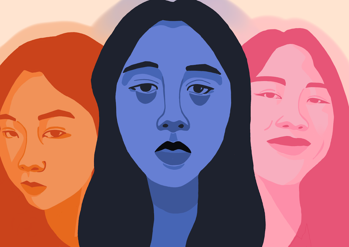
Fig 3.5 Background Design
I liked the idea of the background which was made of the face’s colors, but more translucent and overlapped atop one another. I think the background designs really showcase my indecisiveness since I spent three hours deciding.

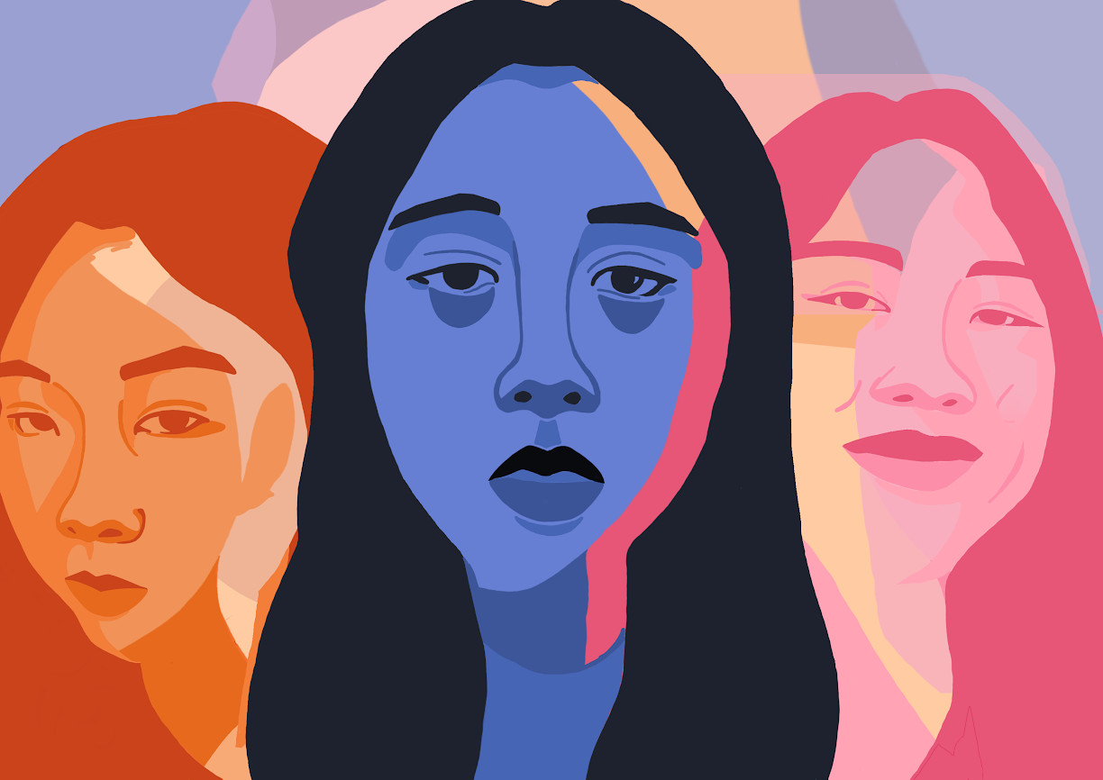
Fig 3.6 Compilation of faces
Using the visual references above, I decided to combine the three faces together by making them transparent. This symbolizes how even though I am just one person, I can have multiple faces depending on who I am with. The blue is for me only, the pink is what I show to the people closest to me - joy and happiness, and the last is a neutral expression to society - that I may seem fun and energetic (orange symbolizes energy) but it is really all a facade.
3. Final Outcome with Rationale

"The Three Faces"
Fig 3.7 Final Self-Portrait Outcome - JPEG A4 Size (21.0cm x 29.7cm)
Rationale: A self-portrait design of my three faces inspired by a Japanese proverb. The first face (blue) is the reflection of myself, never shown to anyone, the second face (pink) is to my close friends and family, and the third face (orange) is to the world.
4. Lecturer's Feedback
Possibility to expand these ideas
REFLECTION
When I first started this project, I always assumed that a self-portrait was a realistic drawing of an artist’s face, but it is much more than that. A self-portrait can be anything you want, as long as it screams you. Many artists use this as a chance to explore themselves whether it be how they see themselves, how others see them, how they feel, etc. The one question that ponders in my head is “Who am I?”. This took me some time to figure out as I truly did not know myself. It gave me a chance to self-reflect and explore my identity and the way I behave and feel around different people. This, led to the inspiration for my design of the three faces, with my best effort to incorporate my feelings and expression around myself, my close relationships, and society in general. This project has taught me many personal lessons; I learned and discovered a lot about myself and the significance of an artist’s self-portrait.
REFERENCES
Kazmi, R. (2021). The 3 faces, a Japanese Proverb theory. Runway Pakistan. Retrieved from https://runwaypakistan.com/the-3-faces-a-japanese-proverb-theory/
Study.com. (2022). What is a Self-Portrait? - Definition, Artists & Examples. Retrieved from https://study.com/academy/lesson/what-is-a-self-portrait-definition-artists-examples.html
Fig 1.2: https://www.fridakahlo.org/the-two-fridas.jsp
Fig 2.2: https://thomasdonaldson.biz/product/three-faced-2-27-21/
Fig 2.3: https://www.petraeriksson.com/
Comments
Post a Comment