.png)
Week 5 (10/01/2023) - Week 7 (24/02/2023)
Joey Lok Wai San (0350857)
Bachelor of Design in Creative Media
Design Principles: Final Project - Visual Analysis
Table of Contents
PROJECT BRIEF
For our final project, we were asked to assess, investigate and analyze a design material of our choice (movie clips/billboards/work of designs). We had to take note of the size, placement, purpose, and aspects of design principles found in that work. Using all this information gathered, we are to create a work of design influenced/inspired by the one we studied, while also applying the design principles to our design work.
I started this project off by watching the lecture video on Visual Analysis by Dr. Yip Jinchi. This is what I learned:
Notes from lecture videos:
What is ‘Visual Analysis’?
Visual analysis is a method of understanding design that focuses on the design’s visual elements and principles. In its strictest definition, it is a description and explanation of the visual structure. (Johnson Museum of Art, n.d.)
The purpose of visual analysis is to recognize the decisions made by the designer when creating the design, as well as to understand how the formal elements of a design convey ideas, content, or meaning.
Visual analysis is a critical part of visual literacy. ‘Visual literacy’ is a skill that helps an individual to interpret, evaluate, use, and create visual media. Practicing visual analysis helps people develop critical judgment skills and seek out answers rather than passively receiving information.
There are three phases to visual analysis:
Phase 1: Observation
Observation means closely looking at and identifying the visual elements of a design, and describing them carefully and accurately to communicate what you noticed. You should not read about the design beforehand.
Phase 2: Analysis
Analysis requires you to think about your observations and make statements about the work based on the evidence of your observations. Think about how the specific visual elements combine together to create a whole, and what effect that whole has on the viewer.
Phase 3: Interpretation
Your observations, description, and analysis of the work are fused with facts about the design work and historical context that you find in trustworthy published sources. What is the meaning of the design? What was the purpose for it to be created?
VISUAL ANALYSIS
United Nations Sustainable Development Goals (UNSDG): Goal 5 - Gender Equality
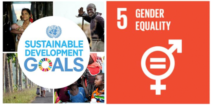
Fig 1.1 Sustainable Development Goals
According to the United Nations (n.d.), “Gender equality is not only a fundamental human right but a necessary foundation for a peaceful, prosperous, and sustainable world”.
Gender equality is when people of all genders have equal rights, responsibilities, and opportunities. Until this becomes a reality, it is of critical importance to end all forms of gender violence and secure equal access to quality education and health, economic resources, politics, employment, etc.
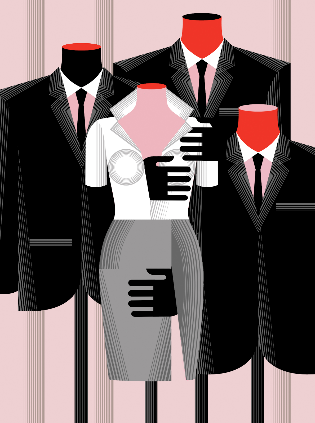
Fig 1.2 Visual Analysis
When I was looking for inspiration, this design piece caught my attention and led me to choose it for my visual analysis. Upon looking at this design, I immediately think about sexual harassment in the workplace. The formal attire leads me to believe it is about employment work, and the hands on the woman’s figure feel unwelcomed and sexual in nature due to its position. Therefore relating to my chosen UNSDG goal which aims to eliminate all forms of exploitation, violence, and discrimination against women.
Phase 1: OBSERVATION
This design work is in a portrait format. For the visual elements present, the main colors observed are white, black, pink, and red. The first figure that caught my eye was the bright white outfit adorned by the woman. In comparison to the other figures, which all are dressed in black, her outfit clearly stands out from the rest. In terms of placement, she is placed front and center, while the others are behind. There are lots of inorganic lines - lines that are generally straight or perfectly curving lines, throughout the composition to create texture. The shadows and highlights are also created through these lines. There are inorganic and organic shapes, both of which are very sharp and easy to tell apart from other shapes.
Phase 2: ANALYSIS

Fig 1.3 Balance and Symmetry
First of all, this design is asymmetrically balanced. There is an unequal visual weight on each side of the composition, where the right side has more elements, thus creating visual dominance. This is balanced out by a lesser focal point on the left side with just one element. Furthermore, there is an almost equal division but the subject matters on both sides are not the same, which creates approximate symmetry. The woman’s figure is front and center, and while the figures on both sides may be a mirror image, some elements are different.

Fig 1.4 Contrasting Lines
The emphasis is on the center image - the figure of a woman - rendered in the brightest colors. The emphasis is defined by the contrasting shapes and colors. The contrast of the stark white outfit worn by the woman’s mannequin against the black draws our focus to the center. Moreover, if we look at the lines that draw the shape of the figures, we can see that the lines on the woman are much more fluid and curved as compared to the straight, sharp lines everywhere else - the men’s figure, background, shadows, etc.
Furthermore, while our attention is first drawn to the woman, we move on to look at the hands covering parts of her; being the same color as the men’s suit allows us to presume it is their hands. This leads our eyes (movement) to the men’s bodies behind the woman who are adorned in business suits. There is proportion in the layout, creating hierarchy - first, we see the most emphasized character, followed by the figures in the back, and slowly to the background.
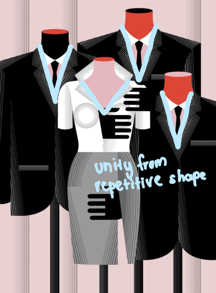
Fig 1.5 Unity and Repetition
There is clear repetition with the three suits due to their color and structure. However, the repetition of the triangle-shaped collars on formal suits throughout the design pulls the look together. There is unity in the overall composition because these elements are composed in such a way that they are balanced and give a sense of oneness.
Phase 3: INTERPRETATION
This is a magazine editorial poster shortlisted for the World Illustration Awards 2019 - in partnership with the Association of Illustrators (The AOI) and the Directory of Illustration. This illustration was designed by the Balbusso Twins exploring the #MeToo movement, more specifically “Has the #MeToo changed what we wear to work?”.
Context of the #MeToo movement

Fig 1.6 #MeToo Movement
#MeToo is a social movement that seeks to end rape culture, sexual assault, and harassment by encouraging individuals to share their own sexual assault or harassment stories (Me too., 2023). The Me Too movement shows sexual abuse survivors that they are not alone. Additionally, it raises public awareness of sexual violence by highlighting how widespread sexual harassment and assault actually are.
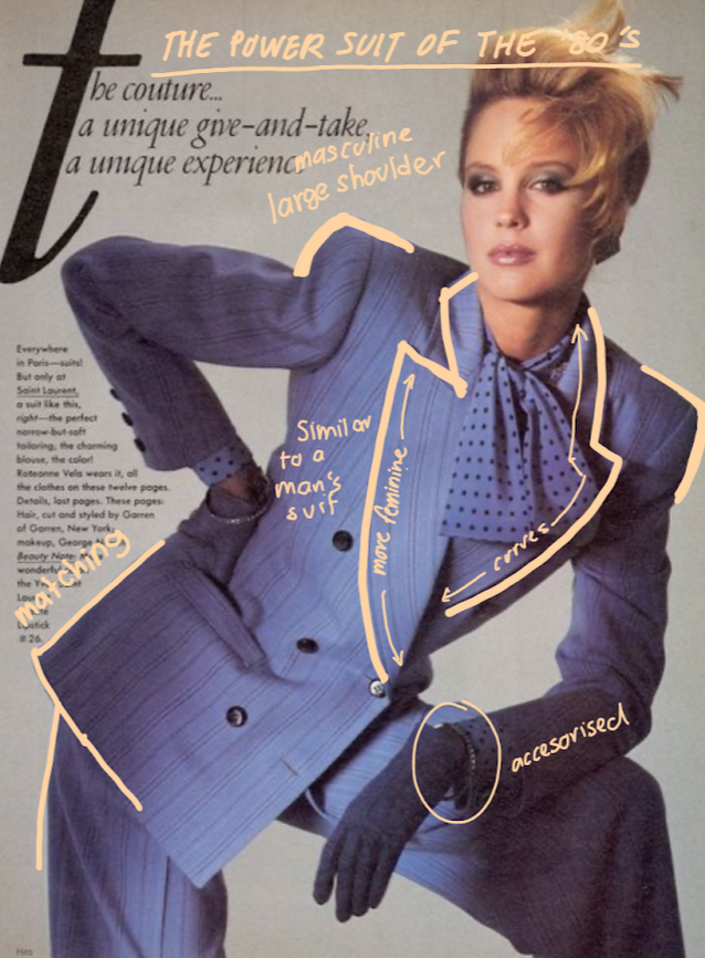
Fig 1.7 Women’s Striped Tailleurs in the 80s
The design focuses on abuse in the workplace. It is a very graphic and minimalistic style which makes it a very clean design. The men in power are represented through the classic suit, and the woman’s clothing seems to be inspired by striped tailleurs worn by women in the 80s. These were power suits that became a symbol of women’s rights in the 1980s. Women were taken seriously in the workplace, and for the first time, they were allowed to wear pants. The suit often had matching jackets and pants. Notice the use of large shoulder pads, to give a bigger and more masculine appearance. While having a feminine element, this power suit was similar to the typical men’s suit. This poster which is designed in a very minimalist manner clearly reflects the theme of sexual exploitation in the workplace.
DESIGN PROCESS
One of the targets of Goal 5 - Gender Equality is to “eliminate all harmful practices, such as child, early and forced marriage, and female genital mutilation”.
When I first read about this goal on the United Nation’s page, I was immediately drawn to how interesting this target of theirs is. I initially wanted to do a piece about female genital mutilation - but my ideas may be too graphic and inappropriate. With that in mind, I have decided to go with the topic of ‘child, early and forced marriage’.
Defining ‘child, early and forced marriage’
Child, early, and forced marriage (CEFM) is a human rights violation that deprives young girls of their childhood, education, and opportunities for growth and stability. It has an adverse effect on women and girls everywhere, prohibiting them from living lives free of all forms of violence. (United Nations Human Rights, n.d.)
1. Visual References
While looking for inspiration and references, what caught my attention was the use of a more dominant figure in control of another in the design. However, this controlling figure is never seen in full detail and, sometimes, only exists as a figment of the imagination. Below are some examples used as my reference (and to better understand what I mean):

Fig 2.1 Visual Reference by Tatsiana Yelistratava

Fig 2.2 Visual Reference by Lorraine Sorlet
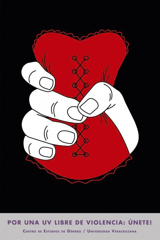
Fig 2.3 Visual Reference by Universidad Veracruzana
As you can see, I was particularly fascinated with the use of hand silencing and/or controlling the primary figure. This is even used in the design I chose for my visual analysis. The presence of the hand feels unwelcoming and nonconsensual. Moreover, I was drawn to the use of contrasting colors, specifically black with brighter colors. I decided to incorporate these elements into my design on child/forced marriage.
2. Idea Exploration
My concept was to illustrate a child being forced into an early marriage, and how she is unable to have a say in and escape from this decision. If there is anything I drew inspiration from the most, it would be having a dominant figure or an unwelcoming hand in control of the child. When you’re so young, you don’t really know what is going on or know how to make decisions for yourself. You tend to follow/believe anything a parent figure says to you; I wanted to show how the girl has no power over anything that happens.
I was inspired by the designs above and chose a very contrasting color palette, especially using black against a bright color to make the design pop. The use of attire and clothing worn by the central figure is also very significant, as noticed in my visual analysis interpretation. The fashion of a character can be a symbol of something much bigger. I plan to incorporate what I have learned from my visual analysis into my own design.
Sketches
(Please note: Anything underlined is an important explanation as to why I made certain choices)
I started off with a rough sketch outline of my design, however, I could not decide which composition I preferred more.
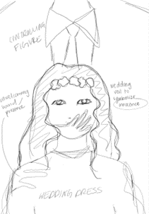
Fig 3.1 Idea Sketch
This idea would make good use of the ‘Gestalt Theory’ design principle. The controlling figure becomes a part of the background and a silencing hand appears out of nowhere.

Fig 3.2 Idea Sketch
While I did initially want to choose this idea, the use of words makes it seem the image does not convey the message strongly enough; almost like I needed to tell the viewer what it is about.

Fig 3.3 Idea Sketch
Once again, I love this concept of a controlling figure not seen within sight but still very much present. The use of puppet hands seems to be a bit overused and cliche in my opinion, and the concept doesn’t really scream ‘child marriage’.
Process
I decided to go with the first idea. As one of my friends said, you can tell exactly what it is about. I also had a lot of back-and-forths with the other two ideas, so why not just go with the one I have the least complaints about.

Fig 3.4 Messy Outline + Blocking Out Colors
After I chose which idea I liked, I roughly blocked it out and filled out the negative spaces for gestalt theory. I really liked the design I was going for after doing this.

Fig 3.5 Design in Development
The piece came together once I drew the girl out properly. I made her look tiny as compared to the male/controlling figure in the background. The veil signifies the element of a child bride.
I was quite satisfied with how everything looked so far, though I decided to experiment around with a few of the elements... just to test out other compositions and placement.

Fig 3.6 Design Experimentation
I decided to play with the bigger ground and strengthen the main subject matter by making her right in the center. I also tried to move the man’s body lower so you could see his neck and a full outline. Just for experiment's sake, I did some cropping here and there but I AM SORRY I DID NOT TAKE A PICTURE OF IT! :(
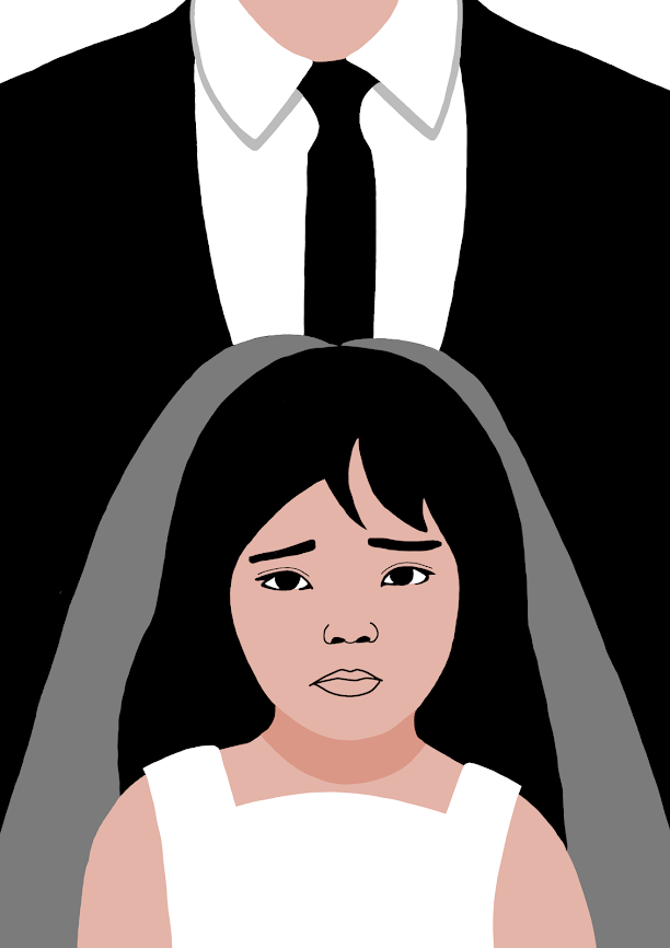
Fig 3.7 Facial Expressions + Dress Redesign
I made sure to give her an uncomfortable look on the face so that she seems worried and uneasy about her situation.
I redesigned the wedding dress (not shown in this picture), where I made the sleeves shorter. The short sleeves make the girl look more exposed and uneasy, which really showcases her discomfort and terror about the situation.
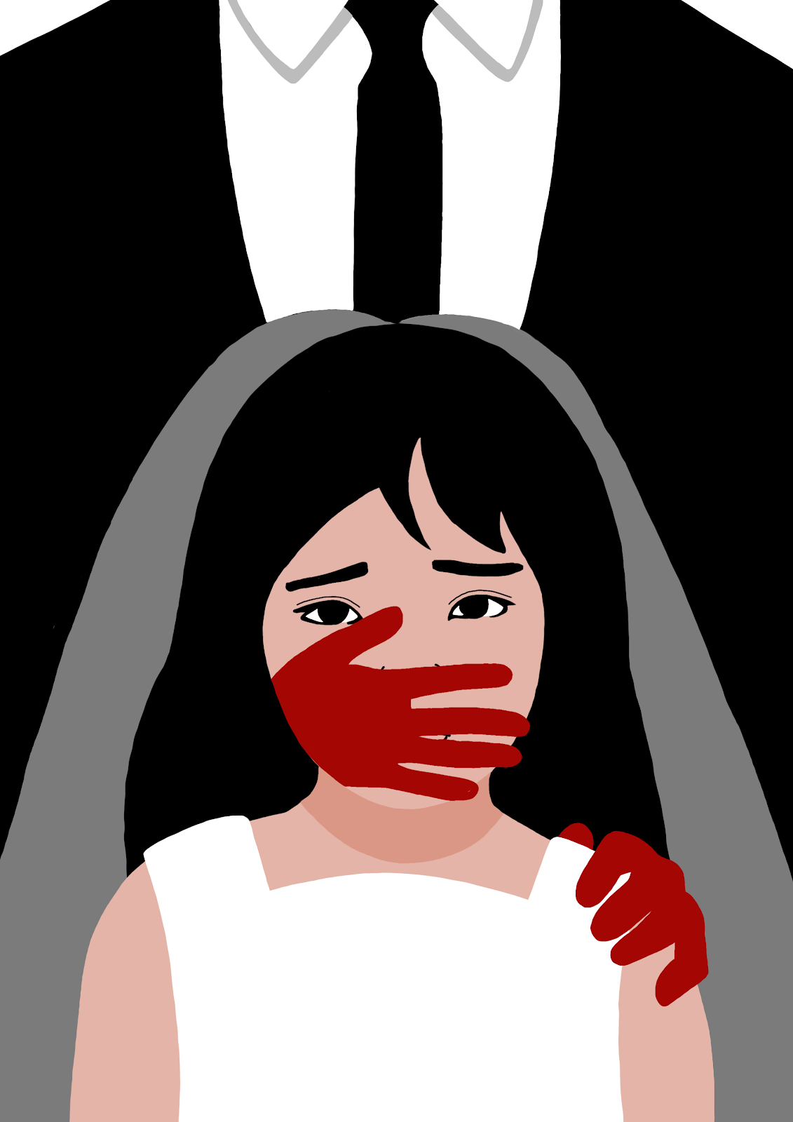
Fig 3.8 Contrast/ Emphasis Hands
The red hand acts as a contrasting and emphasized element to the piece, which the viewer’s attention is first drawn to. It makes the overall design feel striking and shocking.
(FUN FACT: In my ‘Design Principles: Exercises (Contrast)’, Dr. Charles said that the blood red hand I drew could be a series. This is a pretty good continuation of it I would say!)
The presence of the hand also feels unwelcoming and nonconsensual. It is silencing the girl’s voice and opinion - an ode to the main theme of gender equality where women were frequently silenced when it came to their rights.
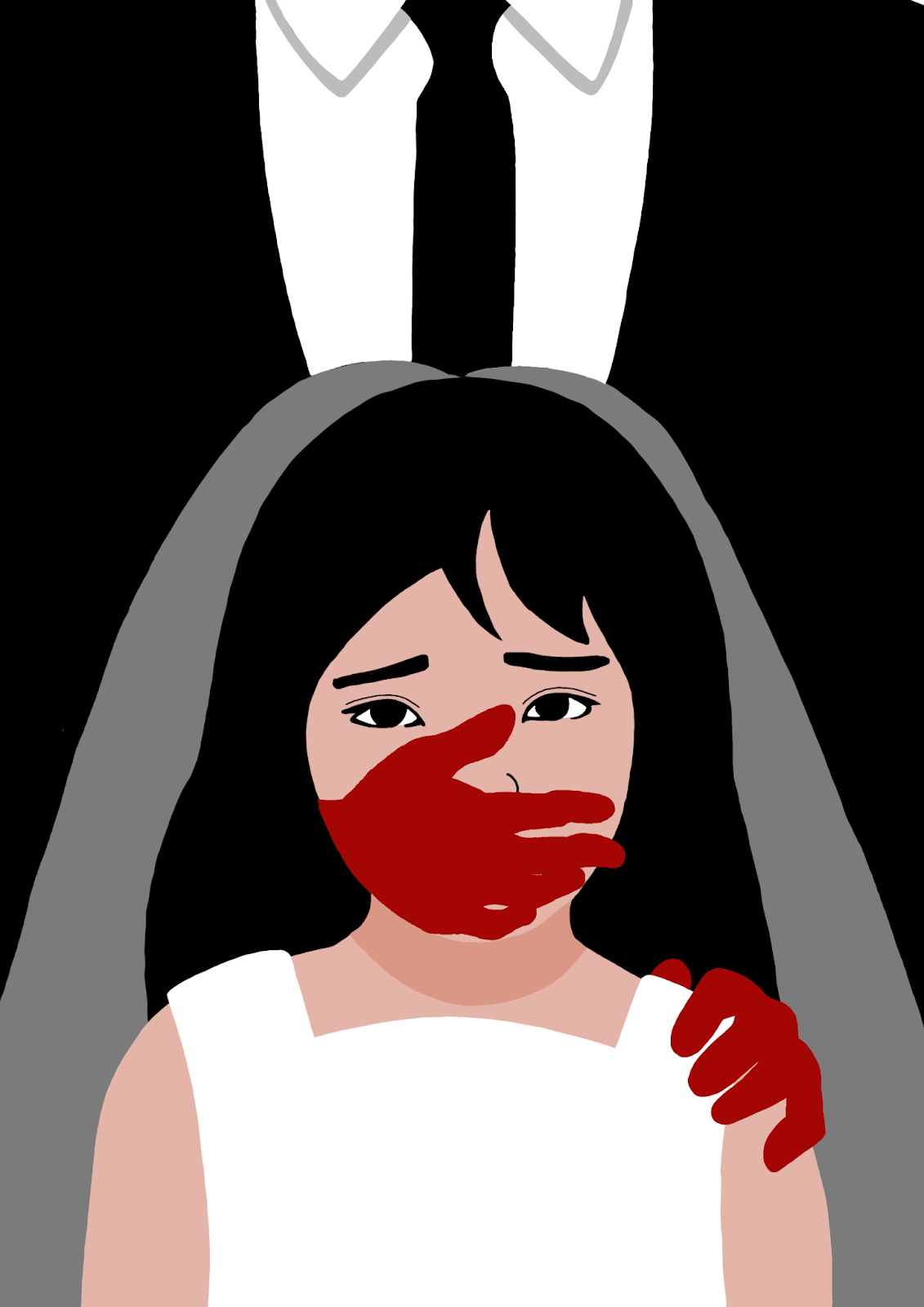
Fig 3.9 Hand Redesign
I decided to redesign the hand a little bit. Instead of making one realistic and one just flat, I made both feel as realistic as possible to create a little consistency.
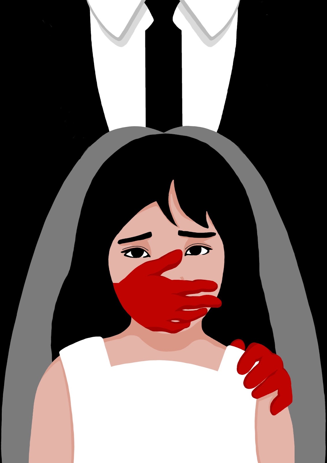
Fig 3.10 Adding Shadows and Touch-ups
After the feedback from Dr. Charles (which I am most grateful for), he recommended I touch up the entire thing and do some minor adjustments in my line work. So that’s exactly what I did.
I made the veil more evenly balanced and did not let it spill into the corner, just to give it a little more shape. Another adjustment I made was brightening the red on the hand. Instead of having it a dark red, the bright red makes it stand out even more. I wanted to add more elements to this design but thought against it. Not everything needs to be overcomplicated and there needs to be a reason behind why this object exists.


Fig 3.11 Decisions
The Veil
I initially wanted a veil to cover the girl’s face but after some thinking, I decided to remove it.
The veil symbolizes a bride's purity and innocence (Creative, 2019). The veil conceals, but is often intended as protection rather than deception; it is also a mark of modesty and virtue in many cultures. For my design of the bride, the veil does not cover the full face. It symbolizes that the ‘protection’ and ‘innocence’ is gone. The girl is married off by her parents and her childhood (also a symbol of innocence and purity) is taken away from her.
The Collar
I added the collar of the suit but I ended up not being happy with any design. I changed it entirely. Taking inspiration from my visual analysis (click here), there is contrast in the use of lines. We can see that the lines on the woman's are much more fluid and curved as compared to the straight, sharp lines on the man’s figure. This creates contrast between the two characters and makes my design influenced by the visual analysis I did.
3. Final Outcome with Rationale

“The Child Bride”
Fig 3.12 Final Outcome - JPEG A4 Size (21.0cm x 29.7cm)
Rationale: A final project design about child marriage from the Goal 5 (Gender Equality) - United Nations Sustainable Development Goals. The young girl’s voice and opinion of the situation is being silenced by the presence of a contrasting red hand; relating to the main theme of gender equality where women were frequently silenced when it came to their rightsThe girl is married off and her childhood is taken away from her.
4. Lecturer's Feedback
Liked the design (YAY!!)
Minor things in terms of execution
Variation of the design - never take anything for granted within a layout space.
Improvement of line work
REFLECTION
When I first started this final assignment, my first thought was “What is visual analysis? Is it really necessary?”. The answer to that is, yes, it is really essential to a design. Every element, whether it is a line, shape, or object, has a purpose in a design. Visual analysis helps us recognize why an artist made that decision as well as how it plays a bigger role in the idea/message they are conveying. If I have learned anything else, it is that not all designs need to be overcomplicated. As long as it gets the message you want through, the design can be as simple as you like. Just make sure you ask yourself, “Why do I place this element here? Why do I need this element? What message am I conveying and how do I make my design showcase this?” With this in mind, I became more thoughtful about what I put in my design for this assignment, and for future artworks. It really gave me a chance to question every decision I make in my work. I also learned a lot about the United Nations Sustainable Goal, more specifically about gender equality. There is so much that still needs to be done before we achieve peace and prosperity now and in the future. This project has really taught me a lot, and I owe it all to Dr. Charles for explaining it so thoroughly to us. All in all, I am really satisfied with the design I created (probably one of my favorites yet). This was a fantastic final project and I gained a lot of knowledge and experience that I have no doubt will influence my future designs.
REFERENCES
Creative, M. (2019). History behind the Bridal Veil. Richmond Times-Dispatch. Retrieved from https://richmond.com/history-behind-the-bridal-veil/article_1d042232-e3f9-11e2-af1e-0019bb30f31a.html#:~:text=The%20veil%20came%20to%20symbolize,the%20white%20veil%20followed%20suit.
Johnson Museum of Art. (n.d.). Visual Analysis 101. Retrieved from https://museum.cornell.edu/sites/default/files/Johnson%20Museum%20Visual%20Analysis%20101.pdf
Me too. (2023). Me too Movement. Retrieved from https://metoomvmt.org/
United Nations. (n.d.). Gender equality. Retrieved from https://www.un.org/en/global-issues/gender-equality#:~:text=Women%20and%20girls%20represent%20half,human%20potential%20and%20sustainable%20development.
United Nations Human Rights. (n.d.) Child and forced marriage, including in humanitarian settings. United Nations. Retrieved from https://www.ohchr.org/en/women/child-and-forced-marriage-including-humanitarian-settings#:~:text=Child%20and%20forced%20marriage%20
Fig 1.1: https://www.un.org/sustainabledevelopment/gender-equality/
Fig 1.6: https://www.usatoday.com/story/news/nation/2019/09/30/me-too-movement-women-sexual-assault-harvey-weinstein-brett-kavanaugh/1966463001/
Fig 2.1: https://arts-select.com/art/stop-domestic-violence-against-women/
Fig 2.2: https://www.newyorker.com/news/our-columnists/one-year-of-metoo-what-womens-speech-is-still-not-allowed-to-do
Fig 2.3: https://www.uv.mx/ceguv/cartel-ganador/
Comments
Post a Comment